2024
Timeline
4 weeks
Services
Branding
The project features detailed brand strategy, audience research, social media campaigns, and case-driven content.
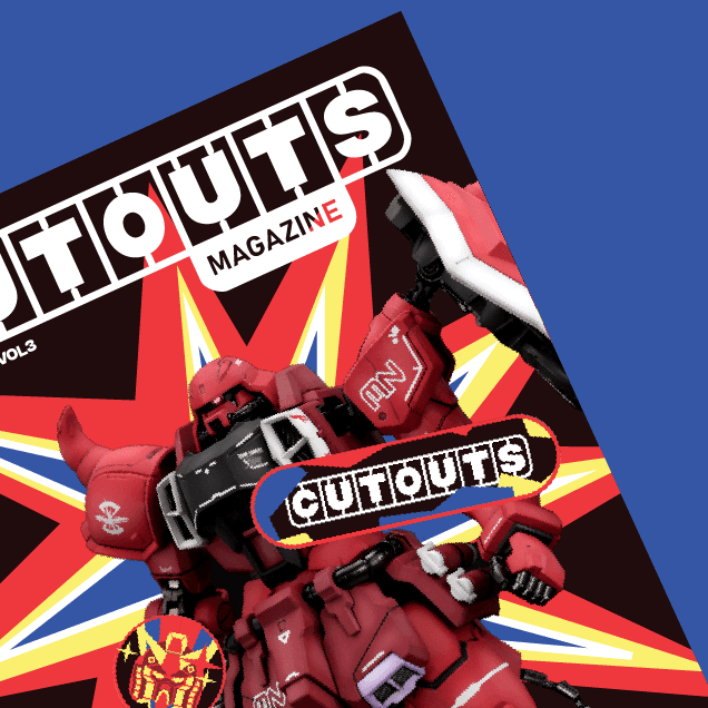
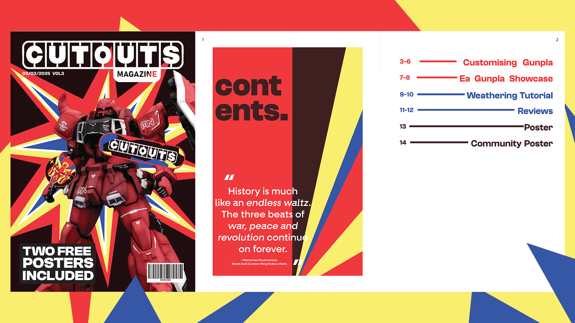
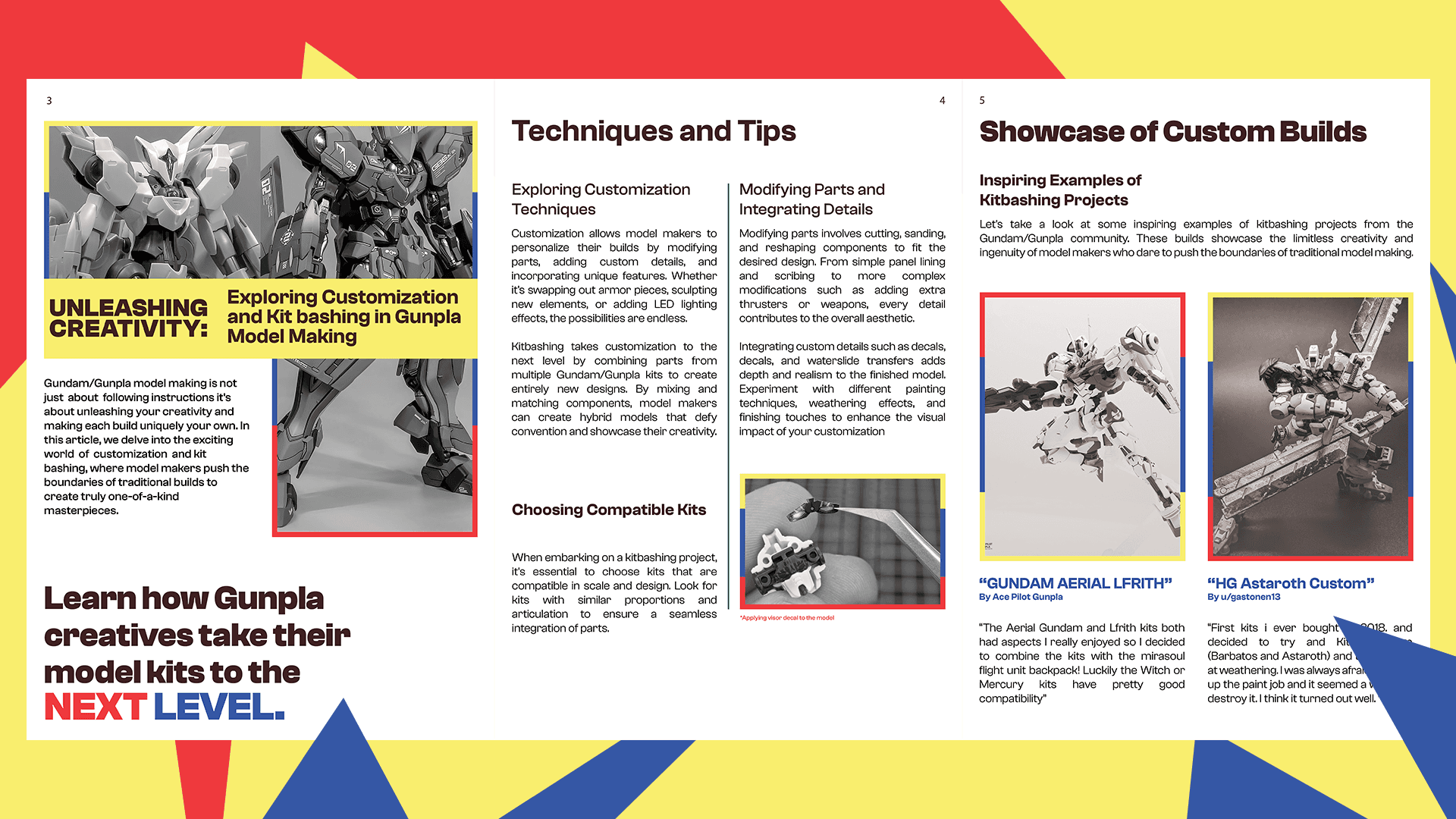
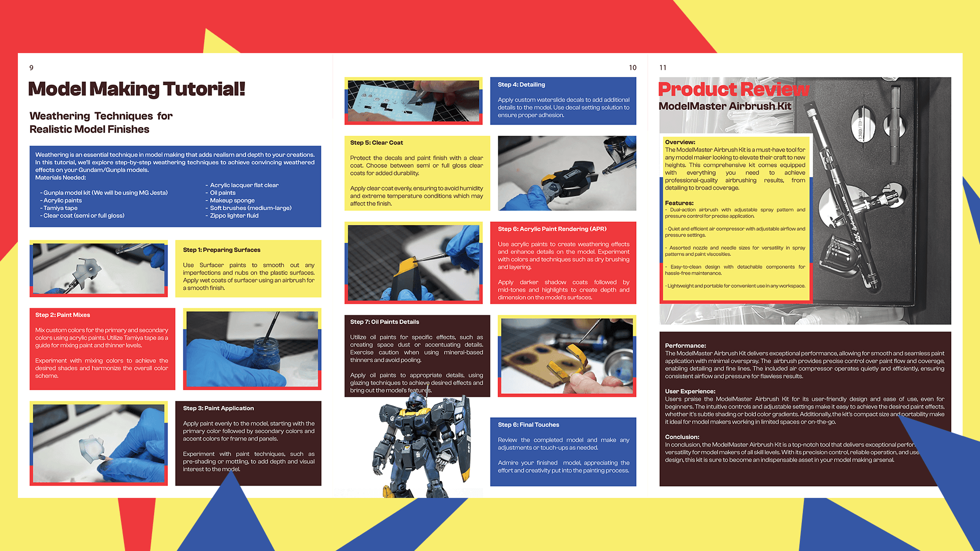
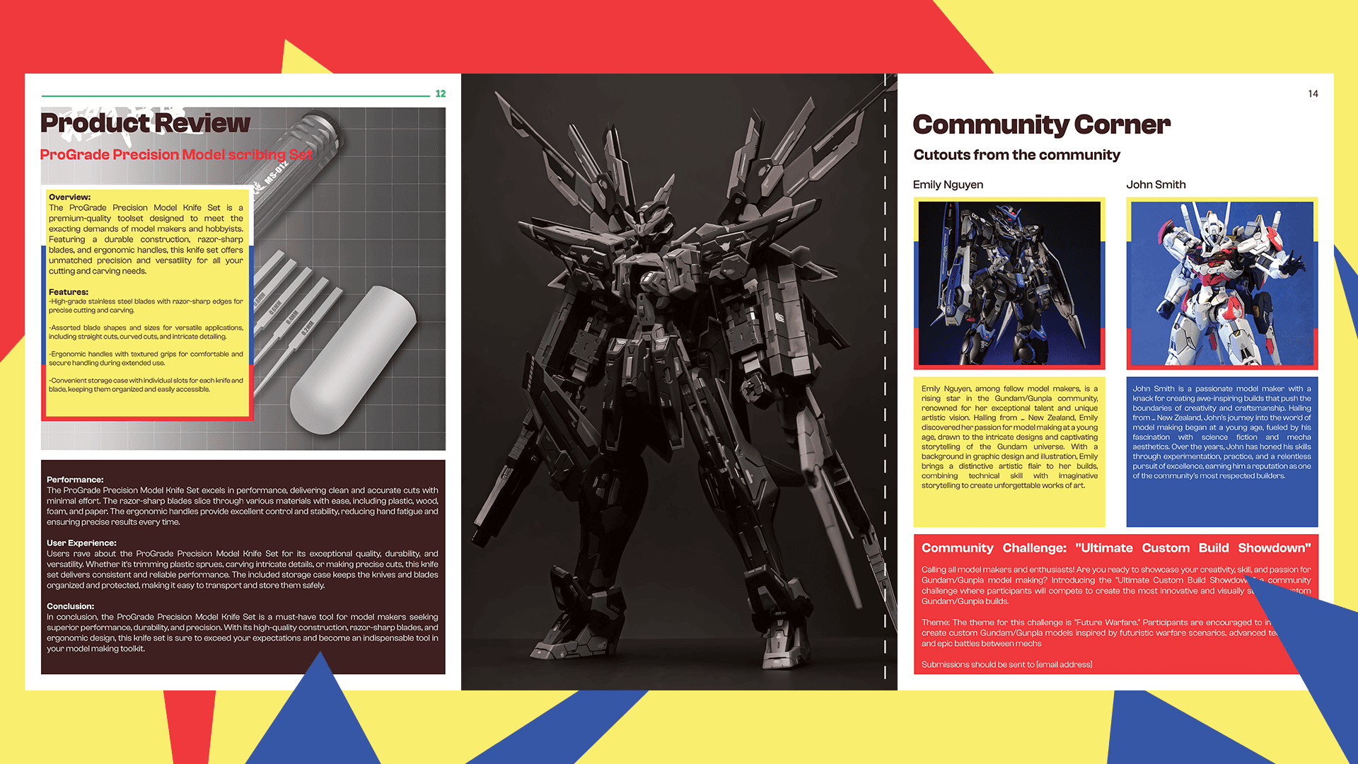
Cutouts Magazine is a bold publication dedicated to the tactile world of model making and hands on design. Combining a love for texture, form, and traditional craft, this project captures the essence of physical creativity in a digital age.


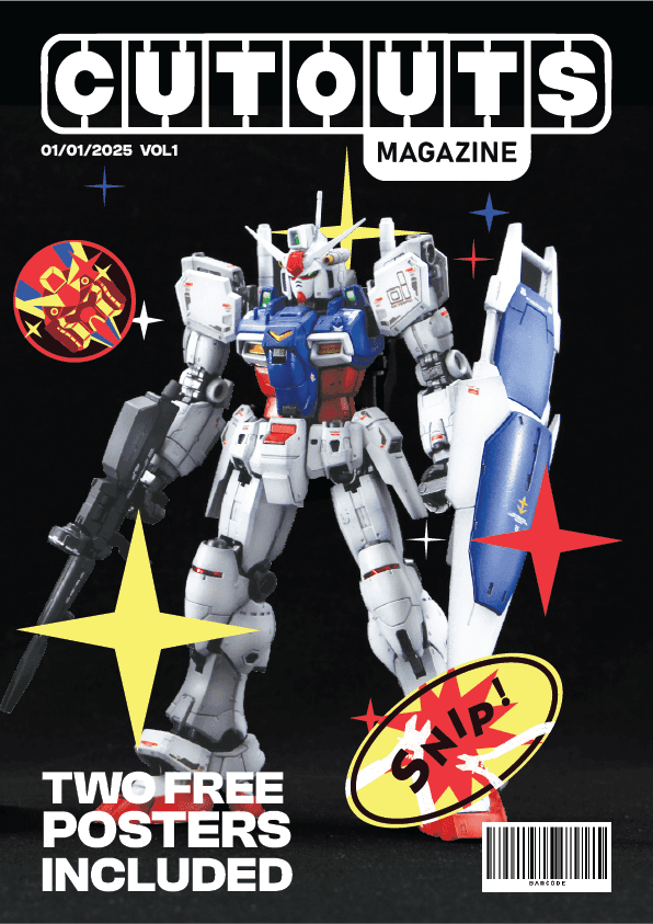
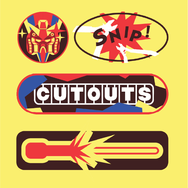
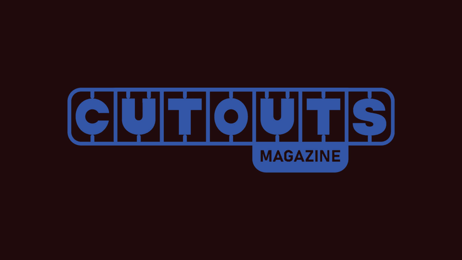
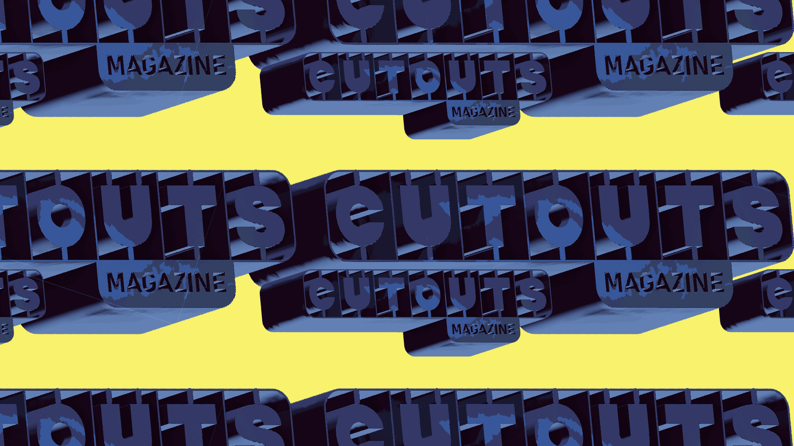
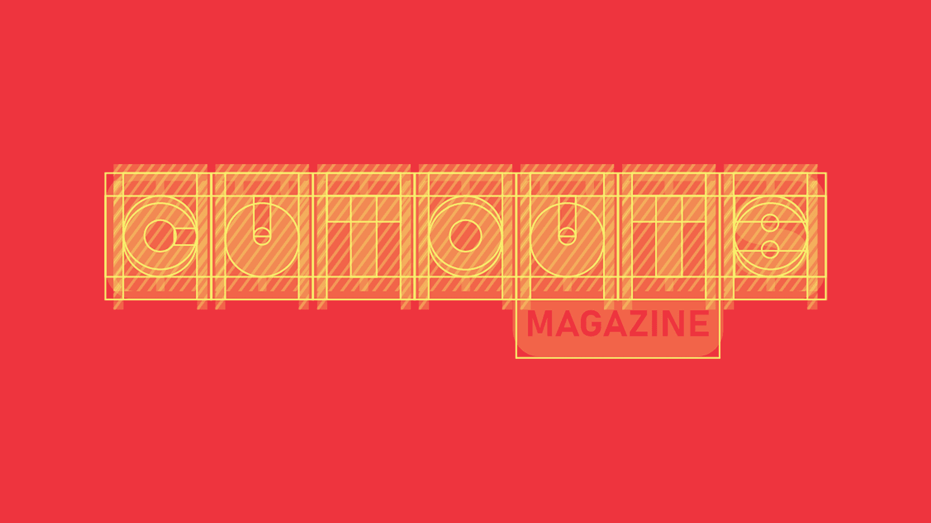
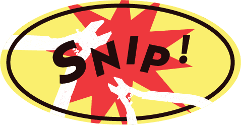
A Logo that every hobbyist
would recognise.
For the logo, we developed a mark that captures the precision and playfulness of model making a clean, geometric cutout shape that feels both crafted and contemporary. Set in a bold typographic style, it reflects the magazine’s focus on structure, process, and creativity.


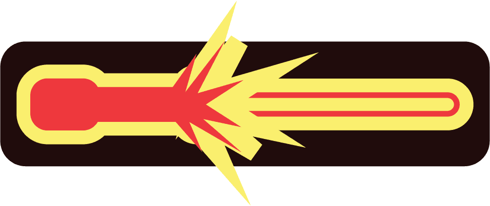
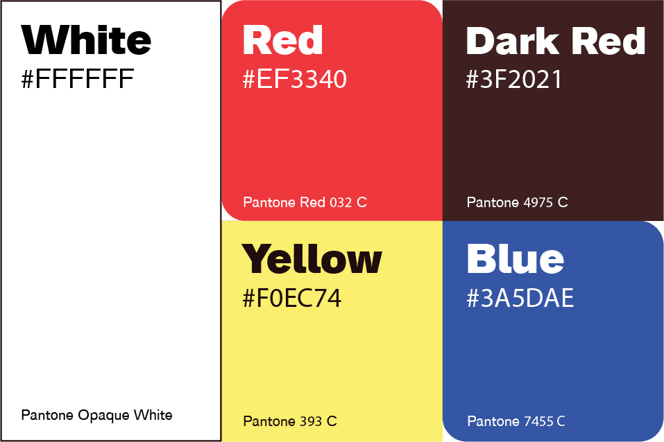
Colour Palette.
The Cutouts colour palette is bold, high-energy, and rooted in the graphic language of retro model kits and explosive packaging design. These colours work together to reflect the tactile, punchy, and playful identity of the Cutouts brand. It’s a palette made to cut through the noise loud, nostalgic, and unapologetically fun.